Candlestick patterns are a really useful way to work out when trend reversals will happen so you can time entry and exit points. If you want to start trading, reading candlestick patterns are essential!

Technical analysis was first used by the Japanese to trade rice back in the 17th century.
Technical analysis is guided by some essential principles:
- Understanding the price action is more important than what guides the price as information is fundamentally reflected in the price
- Traders move markets based on expectations and emotions
- Markets fluctuate
- The market price may not reflect the underlying value of an asset.
Candlestick charting was first used around the 1850’s and was developed by a rice trader called Homma. SInce then candlestick charting has evolved to the more complex form we use today to trade better.
What does a candlestick show?
Candlestick charts use the data for opening, high, low and closing values for each time period you want to display. The body of the candlestick is the middle section and can be hollow or filled. The thin lines above are wicks and below are tails – these shadows represent the high and low range of data. If a stock closes higher than it opened then the body is hollow or filed in green and the top of the body shows the closing price and the bottom of the body reflects the opening price. Whereas if the stock price fell over the period then a filled body or red body is drawn with the top of the body representing the opening price and bottom representing the closing price.
Each candlestick has four data points:
- Open: The opening price
- High: The highest price over a fixed period
- Low: The lowest price over a fixed period
- Close: The closing price

Candlestick charts are the preferred chart of choice for traders as they are visually appealing and easy to interpret. Each individual candle summarises price action showing whether the price has risen or fallen and gives an idea of the spread.
A bullish candlestick is green or hollow and has the open BELOW the close indicating a buying pressure
A bearish candlestick is red or filled and has the open ABOVE the close to show a selling pressure.
What makes each one different?
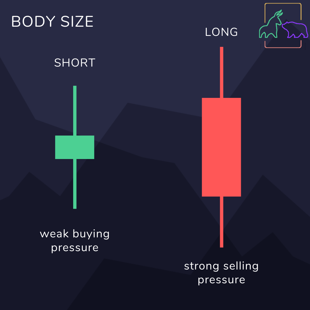
Body size: The length of the body explains how much pressure there is to push the price in one direction. A longer body means there is a more intense buying of selling pressure. Let’s say you see a long red or filled candlestick, this means the open is far higher than the close price. This suggests the price dropped quickly and sellers were aggressive over the period. Although the individual candle reflects a bearish market, remember this is part of a series of candlesticks and it is looking at patterns across a number of candlesticks which gives you the best indication of how the market is moving. The same principle applies if it was a bullish candle. A run of long bearish candles can mark a turning point or resistance level as an extended period of aggressive selling can overdo it and push the market into a reversal where buying becomes more dominant – switching from a run of red candlesticks to green candlesticks.
Shadow Length: The upper shadows represent the session high and the lower shadows show the session low. Candlesticks with short shadows indicate trading action is near to the opening and closing price whereas long shadows show the prices deviate far from the opening and closing prices.
But what happens when the upper and lower shadows are different lengths? A candlestick that has a long upper shadow and a short lower shadow indicates that buyers are putting the most pressure on the period the candlestick reflects, with more buyers, bidding pushes prices even higher but overall sellers force down prices. Whereas candlesticks with long lower shadows and short upper shadows indicate sellers dominate driving prices down before buyers bid prices higher – this strong close creates the long tail.
Check out our guide to common patterns to learn more.
What candlesticks cannot show you
Candlesticks are great for showing you the relationship between the opening and closing price however there are a few omissions. Simplifying price action over a certain time frame is great when you want to step back and analyse the larger trend. Remember you can always change your timeframe to see a more in depth look at the price data.
A candlestick shows the extremes of the trading session and the opening and closing price yet this cannot show the change within the time period for example if the high was before or after the low. Although it seems fairly insignificant, its subtleties of change can present the volatility of that particular asset at that particular time. The difference between a strong bullish presence and a switch between bullish and bearish dominance before bulls coming out on top indicates how strong the trend will be.
Before you invest with your new knowledge, you will need to open an account with a broker to manage your investments.
Choosing the best online stock broker can make the difference from an easy and exciting new experience to constant frustration and disappointment. Accessing financial markets through online brokers is easy and inexpensive but there are so many out there tailored to a different sort of customer so choose the right broker that will optimise your user experience and profits.
If you’re just starting out we recommend eToro and easyMarkets for their easy to use interfaces and fee – free trading.
Now you know the basics on how to read candlestick charts you can get started with trading! We recommend eToro and easyMarkets for beginners.

One thought on “Trading 101: How to read candlestick patterns”